The medical professor smiles smugly at the new intern, unable to draw a conclusion from the long string of integers before him. "What's the matter", he questions, "can't see the pattern". He quickly draws a j-curve, signaling a medical emergency in the next few hours for the patient. What's true for the researchers in 1972's "Terminal Man" seems even more vital today. With the ability to generate so much data, how do we make decisions from it?
Tomar Sagi is building a business around one way. His software converts the thousands of hidden mail messages and contacts from Microsoft Outlook into tangible 3d environments - coloured cubes and blocks denoting what's important and what's not in a few seconds. Functional? For some. Beautiful? Definitely not.


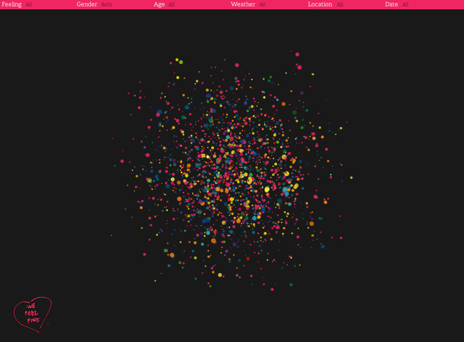
A host of recent projects have attempted to prove that doesn't have to be the case. "Shape of Song" highlights the structure of music - from the repetitive hooks of Madonna's pop anthems to the complexity of masterpieces like Chopin's "Mazurka in F# Minor". Jonathan Harris and Sep Kamvar's piece, "We Feel Fine" extracts feelings from blogs with algorithms, then displays them as an exploded universe of painted spheres. As well as providing insight into the unseen, they mediate the complex world of information for us - cloaking thousands of lines of code and data in line, colour, and form.
No comments:
Post a Comment